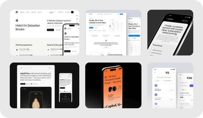
Popular UI Patterns and Graphic Styles in Modern Web Design
by Niloy Kumar, Lead Designer
1. Card-Based Design
Examples: Pinterest, Trello
Description: Uses "cards" to present information in a digestible, visually appealing format. Each card can contain different types of content like images, text, and links.
Benefits: Easy to scan, responsive, flexible layout.
Top tip
Ensure that each card is self-contained and provides a clear, concise piece of information. Use ample whitespace and visual hierarchy to make the content easily scannable. Interactive elements, such as buttons or links, should be clearly distinguishable to enhance user engagement.
2. Flat Design
Examples: Microsoft's Metro UI, Google Material Design
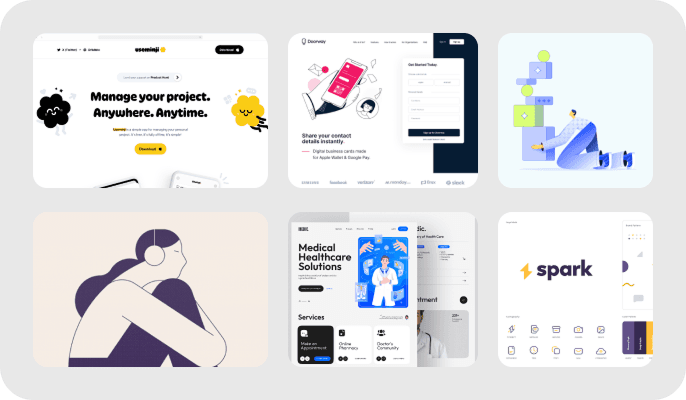
Description: Emphasizes minimalism, using simple two-dimensional elements and bright colors without any stylistic elements like shadows or gradients.
Benefits: Clean and modern look, fast load times, easy to adapt to responsive design.
3. Minimalist Design
Examples: Apple’s website, Medium
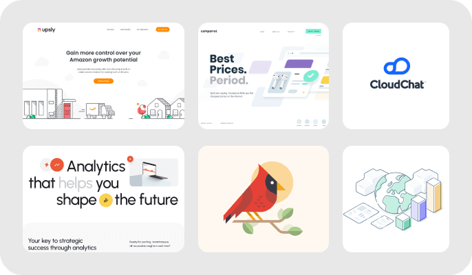
Description: Focuses on simplicity by using a lot of white space, few colors, and minimalistic elements.
Benefits: Clean and uncluttered, enhances readability, faster load times.
Top tip
Embrace White Space – Don't be afraid to leave empty spaces in your design. White space improves readability and highlights key elements, making your content more engaging and easier to digest. Prioritize clarity and simplicity to create a more focused and user-friendly experience.
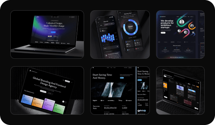
4. Dark Mode
Examples: Twitter, YouTube
Description: Uses dark backgrounds with light text and UI elements, often as an alternative to the default light mode.
Benefits: Reduces eye strain in low-light conditions, can save battery life on OLED screens, modern and sleek appearance.
5. Responsive Design
Examples: Bootstrap framework, ZURB Foundation
Description: Adapts the layout of a website to different screen sizes and orientations, ensuring a consistent experience across all devices.
Benefits: Ensures usability on various devices, improves SEO, enhances user experience.
